1.Coca-Cola
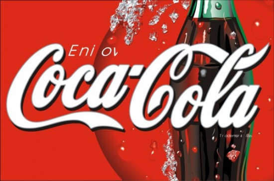
Subliminal messages aren’t always easy to find, especially in popular logos we are used to seeing every day. The most popular brand being Coca-Cola which lends a tribute to its European locations with its white font where each “O” crosses to represent the flag of Denmark.
2.Unilever
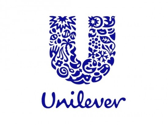
Unlike other companies, Unilever takes pride in its brand and actually represents its products (food, beverages, personal care) through smaller details. For example, the heart represents love, care and well-being, while the bird is a symbol of freedom, relief of daily chores and getting more out of life.
3.Tour De France
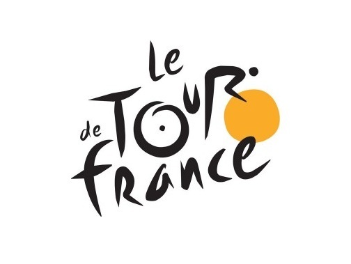
Can you spot the cyclist in the Tour de France logo? We sure can, and truth be told, the yellow circle is supposed to represent the sun which notes that the stages of the cycling event only takes place during the daytime.
4.Tostitos
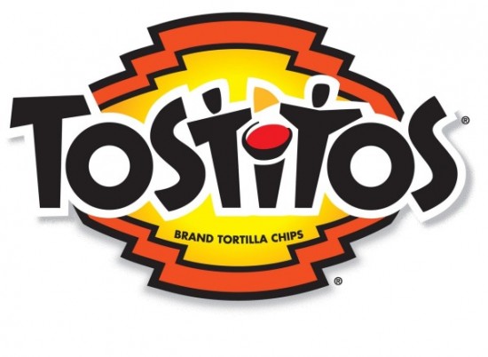
Tortilla chips aren’t just comforting, they’re fun! Look closely at the centre of this logo and you’ll notice two people enjoying a Tostito chip with a bowl of salsa. This design was built to convey the feeling of connecting with others.
5.Toblerone
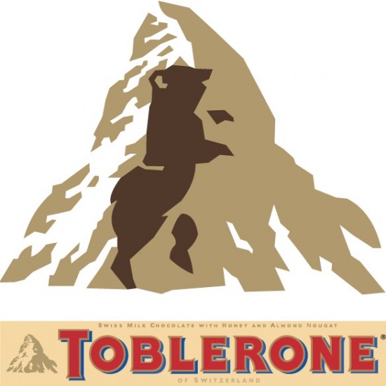
Chocolate bars are more known for gimmicks than subliminal notes – we’re still waiting on that chocolate bar with EVERYTHING – but Toblerone’s logo actually features a dancing bear. The design is a tribute to the Swiss town where the chocolate is created!
6.The Atlanta Falcons
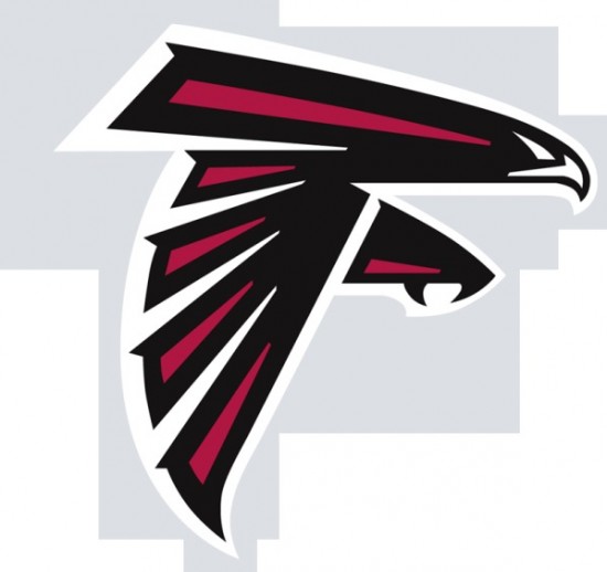
Most people see the bird in the Atlanta Falcnos logo, but it can also be seen as the letter ‘F’. Clever, huh?
7.The Hartford Whalers
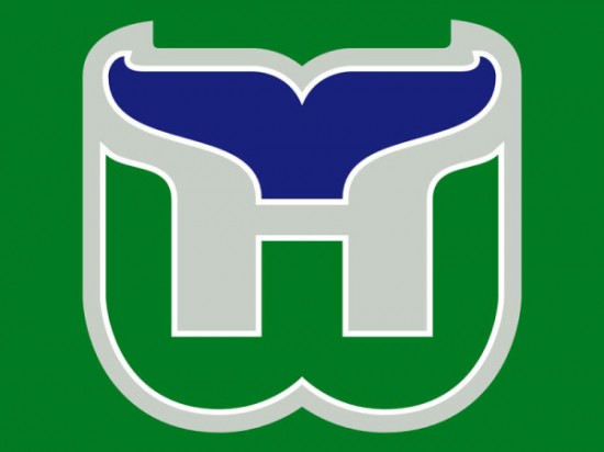
This NHL team is no longer around, but they had a really clever logo. You probably see the whale’s tail, but do you see the ‘W’ and the ‘H’ as well?
8.Spartan Golf Clubs
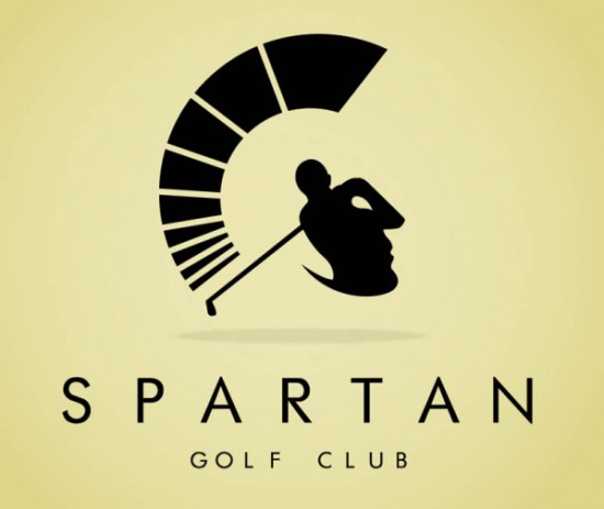
This one might take you a second, but there’s clearly two pictures in this logo. Can you spot the golfer as well as the helmeted Spartan warrior?
9.NBC
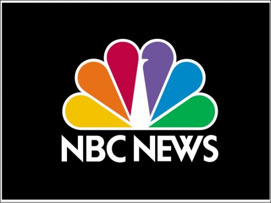
Most of us are pretty familiar with the peacock hiding in the network’s official logo but there’s a lot more than meets the eye. The rainbow palette of its feathers is supposed to state that NBC is a channel not just for Americans, but for citizens of all ethnicities.
10.Sony Vaio
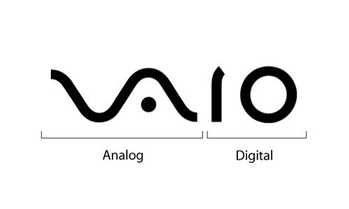
This Sony logo represents the brand’s integration of both digital and analog technology. The “VA” is designed to represent an analog waveform and the “IO” symbolizes binary code.
11.Milwaukee Brewers
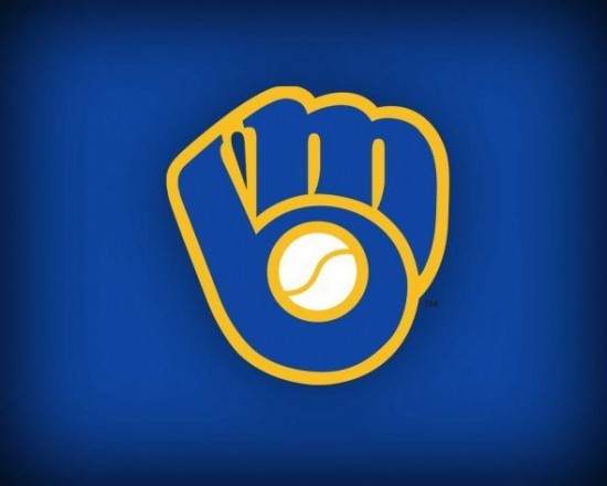
Diving into the world of sports, it’s pretty easy to miss the meaning behind the Milwaukee Brewer’s second logo. Obviously, the MLB logo represents a mitt but it’s normally hard to picture the built-in-letters at first glance.
12.Baskin Robbins
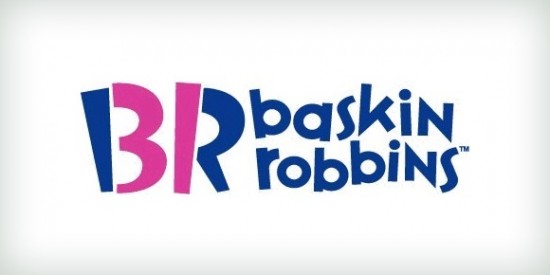
Though some believe the shade of pink to symbolize ice cream, the color choice actually has a different use. Introduced in 2005, this logo uses the company’s initials to cleverly advertise the number of ice cream flavours the chain offers.
13.Bronx Zoo
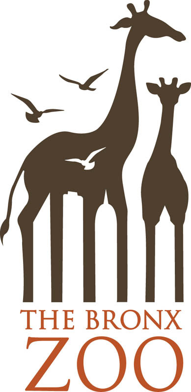
Most people only see the animals when they look at this logo, but take a closer look and you’ll see the Bronx skyline in the negative space!
14.LG Electronics
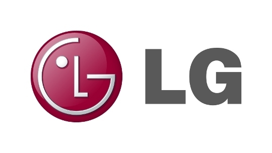
The main purpose of the South Korean multinational electronics company was to create a logo that symbolizes trust and positivity. Luckily, they hit those subjects on the head as not only does their design feature a winking face, but it also references the video game character “Pac-Man”
15.Roxy
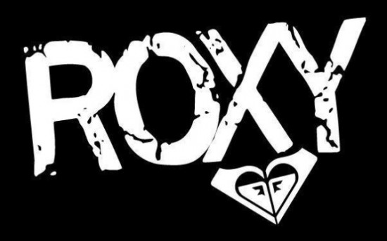
Does the Roxy logo design look familiar? It should because there’s a very good chance you’ve seen it before. It’s almost identical to its parent company, Quiksilver, as the extreme sports clothing outlet combined two of their logos to form a heart.
16.Jack In The Box
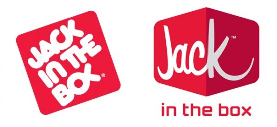
It’s rare to see a fast-food chain change its primary logo (we all thought Wendy’s was a one-time thing) but the folks at the Jack In The Box felt it was needed. After all, their old design did feature a pretty obvious Ichthys/”Jesus Fish”.
17.Hershey’s Kisses
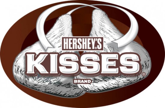
This one is kind of subtle, but there is a secret hidden in the text, can you see it? Between the ‘K’ and the ‘I’ you can actually see a Hershey’s Kiss!
18.Goodwill’s Smile
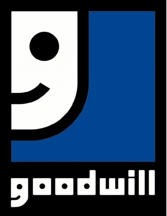
You’ve probably seen this logo a thousand times, but have you ever noticed that the smiling face is actually just a close-up of the ‘G’ in the Goodwill font?
19.FedEx
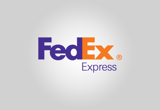
Originally known as FDX Corporation, FedEx was founded in Little Rock, Arkansas in 1973. Since then, they’ve always been about moving forward as even their logo features an arrow in the negative space of two of its letters.
20.Eighty Twenty
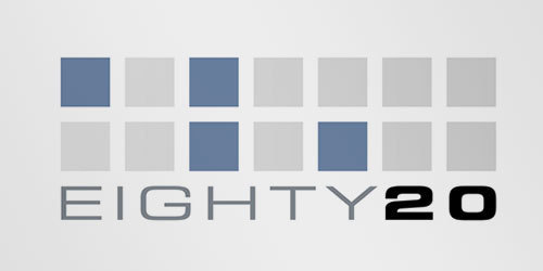
It’s hard to tell if you don’t know what Eighty Twenty is but the market data research company actually incorporated the binary code spelling of their company’s name. With blue and grey squares as zeroes, the top line is 1010000 (80) and the bottom line is 0010100 (20).
21.Pittsburgh Zoo
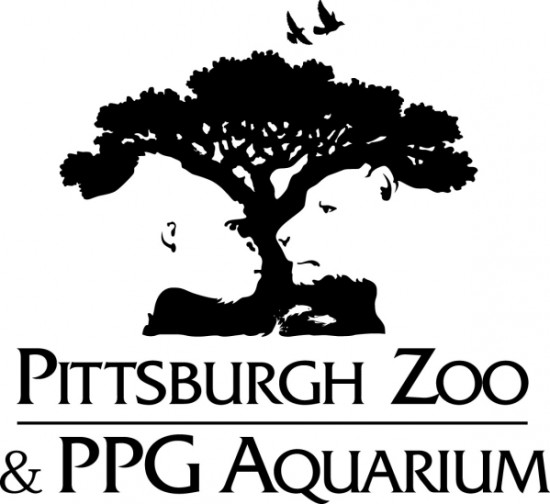
This is a great example of negative space. When you look at this logo you’ll probably either notice the tree and birds or the animal faces, but did you notice both?
22.Amazon
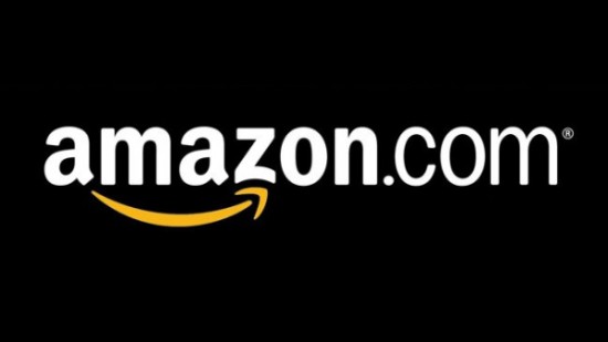
Clever and innovative, Amazon’s logo holds two distinct meanings. The first is the arrow that points from A to Z – referring to everything being available on their website – while also signifying a satisfied smile that’s accented by a dimple.