Logos are a way to represent your company in a small, repeatable image that will be associated with your company sometimes forever. While many big companies and organizations take this very seriously, others don’t. Smaller companies and organizations usually suffer the most and though it’s good to give them a little leeway, some of these logos are simply inexcusable. So, here are 10 absolutely terrible logos.
1. K9 Compassion Foundation
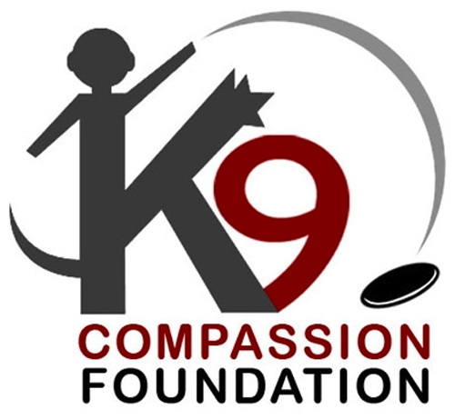
It’s pretty hard to decipher this company’s logo. Are the dog and the man stuck together and why is there a tail coming out of the man’s body? They were obviously trying to get in a dog and man playing happily together, but the concept suffered in the design stages.
2. Central Idaho Arms & Airsoft

What’s the first thing you think of when you see this logo? Probably a certain government organization known for intelligence gathering and not a firearm dealer. You never want to give people a false impression of what your business does and this logo seems to intentionally do that by leaving off the last “A.”
3. Pool Service Company
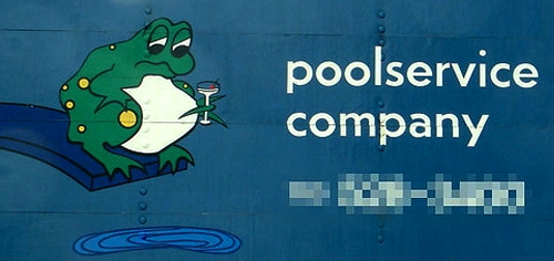
This logo doesn’t seem to make much sense. There is a sad frog holding a martini on a diving board while looking down at a small puddle. It doesn’t really say what the company is all about. What makes this even worse is that three screws on the billboard give the impression that the sad, drunk frog is relieving himself.
4. The Field Center For Children’s Policy
![]()
The intention of this logo is fine. The designer tried to incorporate a person and child into the F and C to represent the field center, but it’s done a way that it looks inappropriate. Perhaps the person is giving the child a hug or perhaps the person is doing something less tasteful. Either way, this should have been reviewed.
5. Professional Software Solutions
![]()
The worst logos are those that look outdated and this is probably the perfect example of how to make something look old. They took a really old-looking font and combined three colors that look like the belong on computers from the 80s. Then they added a yin yang sign, which doesn’t seem to relate to what they do.
6. Hip Hop For HIV
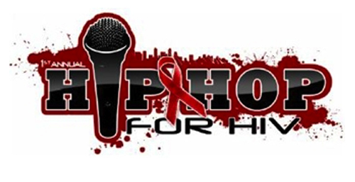
Although this organization is definitely for a good cause, there seems to be something pretty awful about it. You don’t want to advertise an event for HIV with images of splattered blood all over the place. It’s quite distasteful.
7. The Kids Exchange
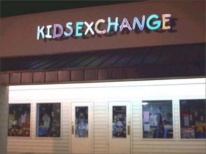
This could have been a potentially good logo. It’s about kids and it has a variety of playful colors written in child-like text. However, the placement of the words so closely together makes it look like it’s a completely different business. A simple image to separate the two words would make this work.
8. Pearl Children Care Centre

It’s hard to tell what this image is and therefore what the organization does. It looks like the angry face of some monster or a tree with two orbs.
9. COBRA Consortium on Breast Cancer Pharmacogenomics
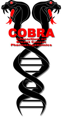
The last thing you want to associate with breast cancer are two angry cobras that are black with glowing red eyes. This is simply not representative of what the organization does.
10. Spa Warrior
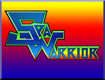
Unfortunately, this place seems to have gone out of business, but you have to wonder if it’s the logo’s fault. When it’s your goal to stick every imaginable color from the spectrum, you’re going to end up with a bad logo.
About the author: Jack Thompson is design whiz and blogs about a wide range of topics from herbal incense to logos.